SiFT kernels#
We provide examples for the different SiFT kernels
We use the Drosophila wing disc development single cell data [1] for the demonstration.
[1]:
import numpy as np
import scanpy as sc

import sift
Load and set the adata#
[2]:
DATA_DIR = ".../drosophila.annotated.h5ad" # set path to anndata
[3]:
adata = sc.read(DATA_DIR)
[4]:
nuisance_genes = np.concatenate((adata.uns["sex_genes"], adata.uns["cell_cycle_genes"]))
adata.obsm["nuisance_genes"] = adata[:, nuisance_genes].X
adata.uns["nuisance_genes"] = nuisance_genes

gene_subset = [g for g in adata.var_names if g not in nuisance_genes]
adata = adata[:, gene_subset].copy()
Define SiFT kernels#
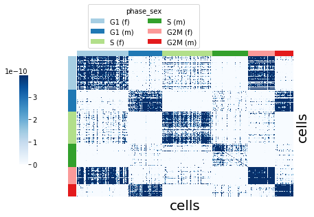
RBF kernel#
The RBF kernel, aka squared-exponential kernel, defines distances between cells in the given space using:
where \(l\) is the length_scale parameter.
Here we consider distances based on the nuisance_genes by setting kernel_key=nuisance_genes. We define adjust the length_scale by passing kernel_params = {"length_scale":0.5}
[5]:
metric_ = "rbf"
kernel_key_ = "nuisance_genes"
kernel_params_ = {"length_scale": 0.5}
[6]:
sft = sift.SiFT(
    adata=adata,
    kernel_key=kernel_key_,
    metric=metric_,
    kernel_params=kernel_params_,
    copy=True,
)
INFO sift: initialized a SiFTer with rbf kernel.
Visualize the kernel using plot_kernel().
groupby: thekeyin theanndatawe can group the cells by.color_palette: colors for thegroupbygroups.
[7]:
sft.plot_kernel(groupby="phase_sex", color_palette=adata.uns["phase_sex_colors"])
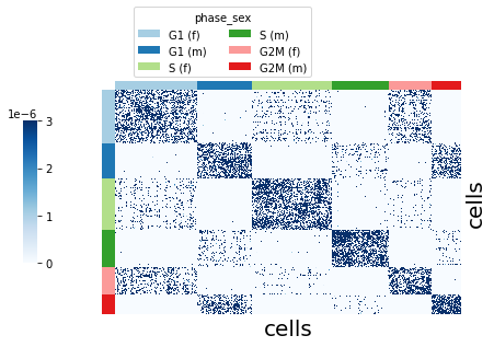
k-NN kernel#
The k-NN connectivity graph defines the cell-cell similarity kernel. The connectivity graph is computed over the attributes given in kernel_key (a key in the adata object), here we consider kernel_key=nuisance_genes.
The n_neighbors parameter defines the number of neighbors in the connectivity graph.
[8]:
metric_ = "knn"
n_neighbors_ = 5
kernel_key_ = "nuisance_genes"
[9]:
sft = sift.SiFT(
    adata=adata,
    kernel_key=kernel_key_,
    n_neighbors=n_neighbors_,
    metric=metric_,
    copy=True,
)
INFO sift: initialized a SiFTer with knn kernel.
Visualize the kernel using plot_kernel().
[10]:
sft.plot_kernel(groupby="phase_sex", color_palette=adata.uns["phase_sex_colors"])
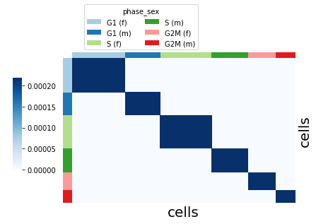
Mapping kernel#
The mapping kernel takes a mapping of the cells to a given signal. Here we use the deterministic mapping of the cells to the cell cycle phase & sex label, using kernel_key ="phase_sex".
[11]:
metric_ = "mapping"
kernel_key_ = "phase_sex"
[12]:
sft = sift.SiFT(
    adata=adata,
    kernel_key=kernel_key_,
    metric=metric_,
    copy=True,
)
INFO sift: initialized a SiFTer with mapping kernel.
Visualize the kernel using plot_kernel().
[13]:
sft.plot_kernel(groupby="phase_sex", color_palette=adata.uns["phase_sex_colors"])
[KeOps] Generating code for formula Sum_Reduction((Var(0,6,0)|Var(1,6,1))*Var(2,19885,1),0) ... OK